Find a Web Designer near you
The average rating for Bark Web Designers is 4.88, based on 34,159 reviews

So much effort goes into getting people onto your website, with businesses going to great lengths to refine their SEO, PPC, social media marketing and beyond. But have you ever considered what happens when users view your website?
Your website is the digital face of your business. Therefore, you need to make sure its design hits it out of the park in terms of looking professional while also being entirely functional too.
However, when setting up a website, it’s so easy to get lured in by the ‘quickness’ of a pre-made template or even to simply make things up as you go along, despite not being a designer yourself. If you want to increase your website visitors and ultimately your business conversions, it’s time to get to the root cause of what’s holding your website back.
Here are 5 of the biggest web design mistakes to avoid that might just ring a few bells...

The one thing physical and online retail has in common is that customer experience is everything. Imagine walking into a store that had no sense of organisation, where the signage leads to the wrong products. It would take you hours to find what you were looking for. You’d rather head elsewhere to another store, right?
That same analogy is being repeated for websites that have a poor user experience but in a digital sense. By user experience, we mean how easy it is for your visitors to navigate your website, and complete any steps such as purchasing a product or finding the exact page they are looking for.
The more you keep your users in mind within the design, the more likely it is they will complete the actions you want them to do. All of which hinges on the user experience your website provides.

Making colour work well on a screen is a delicate balancing act. If you’re not familiar with the colour wheel especially in a web design capacity, it’s very easy to get things wrong. By wrong, we mean clashing colours, too much colour use or even colours that subconsciously signal the wrong messages about your brand, without you even realising it.
The last thing you want is for your website to give visitors a headache or to confuse them. Do this and they’ll exit never to return. Whatsmore, Google will make note of these sudden exits, deem your website as not a helpful result, and will slide your page further down the search engine rankings.
That doesn’t mean to say you can’t use colour on a website. The key is making sure it's done in a thoughtful, screen-friendly way. Whatsmore, a web designer can also build a ‘dark mode’ function, so that your visitors have the option of removing any harsh white lighting when browsing at night.
Another common web design mistake is not putting enough emphasis on the speed at which your website loads.
Research has shown the average user will wait up to 2 seconds for a page to load before making a swift exit.
There are many different reasons why a website is slow to load that usually can be traced back to the web design itself. It could be too many images or videos eating up the bandwidth, or even a bug within the coding. If you’ve purchased a website template, these can be notoriously problematic as they aren’t easy to change beyond basic customisations.
Australian websites that do business internationally have an even bigger reason to worry about slow load times. That’s because, if your website is slow, and also doesn’t have a CDN (content delivery network) that replicates your site in servers around the world, this means your website data has to travel thousands of extra miles to reach the visitor. So that 2 seconds is going to be more like 20 for someone in the USA or UK.

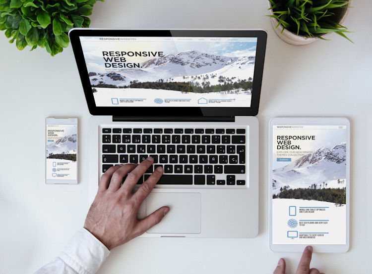
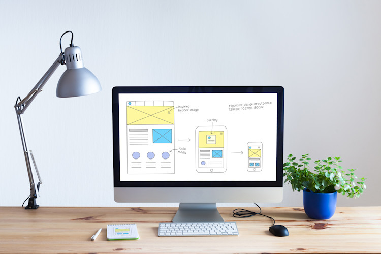
Another mistake to avoid in web design is failing to make your website responsive. Open up your website on different devices such as a mobile, laptop and tablet. What you are greeted with might just surprise you, especially if you had no idea your website doesn’t open correctly on all devices.
A responsive website automatically adapts to the dimensions of the device it is being viewed on. This matters, because increasingly more people than ever access the internet on their phones, whereas traditionally web design was for desktop viewing only.
Unless you fix the issue, users won’t be able to read the text, view images or click on any buttons properly. Similar to a chocolate teapot, a non-responsive website simply isn’t fit for purpose.
Have you ever landed on a page where it said ‘404 not found’, or words to that effect? Such errors are caused by broken links, either because the link was misspelled when embedded, or the page has since been removed.
If your website has broken links it matters because firstly it’s annoying to the user, but secondly, it could be preventing vital actions from taking place on your site, such as a purchase or a contact form submission. It’s yet another problem that’s also harmful to your SEO.
Web design isn’t just about the visual elements, but making sure everything is in good working order. Removing broken links is going to greatly enhance all your other marketing efforts because users can get to where they need to be without disruption.

It’s tricky to price web design exactly since some jobs require a quick tweak and others are full redesigns. However, we've created a price guide to give you an idea of web design costs in Australia.
Both web designers and web developers are integral to building and maintaining your website. The simplest way to distinguish the two is that web design focuses on the visual elements, whereas web developers focus more on coding and similar backend elements. Some web designers may also offer web development services and vice versa.
Again, both web design and graphic design are very similar specialisms. The main difference is that a graphic designer creates aspects such as logos, social media graphics, signage, packaging, flyers, posters etc. A web designer solely designs the content to be placed on a website and does not create items intended for print.

There are an estimated 23 million web designers across the world. Are you ready to be connected to the top local ones in Australia? Whether you’re looking for a web designer in Sydney, Wollongong, Perth, Canberra, Melbourne or beyond Bark has got you covered.
Simply tell us your location and what you need a web designer for. We’ll connect you with the best web designers near you to get your website reaching its potential in no time.
The average rating for Bark Web Designers is 4.88, based on 34,159 reviews
Looking for a professional website to bring your business to the next level but not sure about costs? Find out how much you’ll pay for a web design service based on where you live, the scope of the project, and more.